Yesterday, the state of Illinois announced that suburban Cook County is now subject to covid mitigations, in which, as of tomorrow, indoor dining and bar service will be prohibited and groups at any one gathering will be capped at 25 people. As the Chicago Tribune reported,
By Wednesday, more than half of Illinois residents will be living under stricter measures meant to slow the latest surge of the coronavirus as suburban Cook County and the Metro East region outside St. Louis join four other regions where the state has shut down indoor dining and bar service and lowered the cap on crowds to 25.
A week ago, only one of the 11 regions in Gov. J.B. Pritzker’s reopening plan was subject to those rules. . . .
Suburban Cook County has had eight consecutive days of test positivity rate increases and seven days of increased hospital admissions. It is the first region to surpass the state-set thresholds for those two metrics at the same time. The other region have triggered tougher rules by reaching an 8% positivity rate threshold for three consecutive days. As of Friday, the rolling seven-day positivity rate for the Cook County suburbs was 7.7%.
With that context, I wanted to write down some of my recent thoughts on developments.
First, why did contact tracing fail?
Contact tracing was, after all, the subject of my May 15 Tribune commentary, in which I observed that the state’s reopening metrics required that for Phase 3, contact tracing would be fully-rolled out, and for Phase 4, contact tracing would be fully scaled up, so that tracing would begin within 24 hours for 90% of new diagnoses in a region. Turns out, Phase 3 began according to the timeline for all the other metrics, at the end of May, and Phase 4 began at the end of June. But according to the organization TestAndTrace, as reported at Patch, Illinois has a failing grade in their assessment of Illinois’ contact tracing, due to their very low number of tracers and lack of transparency about their progress.
With respect to Cook County, the Cook County Department of Health announced on June 11 the receipt of a $41 million grant to scale up contact tracing. But even just last week, Daily Line reporter Alex Nitkin had this to say:
Meanwhile, Cook County public health chief Dr. Kiran Joshi tells commissioners the county/city's joint contact tracing effort is deep in the recruiting process and expects "offers to go out in the next week or so."
— Alex Nitkin (@AlexNitkin) October 21, 2020
Now, the question above is, I admit, partly rhetorical. I have my own suppositions as to why, when it really would have made a difference in the late spring/early summer, when cases were down and when Illinoisans were relatively more hunkered down — that is, when a contact tracing effort would have uncovered fewer contacts for any given individual — the state, and Cook County and the city of Chicago as well, fumbled this: the desire to create union jobs, for one, and the focus on “equity” even when a focus on “low-hanging fruit” might have been more effective. Various reports in the meantime have described the suspicion with which immigrants and low-income Chicagoans treat contact tracer outreach; focusing resources on parts of the state which would have a greater success rate, as well as more rural areas where there would have been fewer contacts to trace in the first place, would surely have found more success.
In any event, at this point, it is far less effective to contact-trace when cases are becoming increasingly prevalent, as is the case now.
And, in addition, it would appear that the state is misinterpreting the data that it does garner from contact tracing, in any case.
Earlier in the month, Capitol Fax provided a graph produced by the state which was used as justification for its focus on bars and restaurants. The graph is appallingly difficult to read (and is shown only as a picture, with no data accessible), but claims that, statewide, when contact tracees were asked where they had “visited or worked” within the past 14 days, the second-largest category of response was “restaurant/bar,” with 2300 responses. The top response was “other,” which includes “vacations, family gatherings, weddings, college parties.”
But this graph is exceedingly unhelpful. Respondents could give multiple answers, and the graph’s “n” is given as 17,939, but that’s the total number of boxes checked; a true “n” from such a survey would be the number of people surveyed. We don’t know what percent of tracees visited bars or restaurants, and, more importantly, we don’t know whether people who went to bars/restaurants were disproportionately likely to have been diagnosed with covid. In other words, to tell us something meaningful, this graph would need to be paired with another one, in which a random sampling of people who matched the demographic characteristics of covid-diagnosed tracing respondents.
And, in fact, here’s my transcript of Dr. Ngozi Ezike’s comments at the press briefing last Friday, upon being asked why bars and restaurants are being singled out for closure despite being linked to only 6% of outbreaks (about the 28 minute mark):
Ezike: An outbreak would be something if somebody works like say at a manufacturing plant and a lot of people work in close proximity and 50 people develop covid in that setting we would have that as a documented outbreak where this person knows that I was working next to this person, this person contracted the virus, a week later so did I, a week later this person did, three days later, so that is like a clearly documented outbreak. In most cases of covid, the person who has it cannot tell you exactly who they got it from, they cannot say, “oh, I was working in this setting and all these people got it and I got similar symptoms, so in the absence of a documented outbreak all those individuals that did contract the virus the way that you look at where they may have gotten it from is to look at the time at which, the time frame from when you catch the virus to when you show symptoms or to whey you’re diagnosed, in those preceding two weeks, we ask the cases, where have you been, and all of those places that they list, that they have been in the preceding two weeks are exposure sites. Any of those places could have been where they contracted the virus. And time after time, bars and restaurants come up as the number two or the number three place of all of these places frequented, so that’s why we put it as a high because it consistently comes up as a place where people who are infected listed as one of their exposure sites.
What’s remarkable is that Pritzker appears to recognized that this is a poor rationale for closing bars and restaurants, and he jumps in:
Pritzker: And I would just add that there are literally a dozen studies, many many articles about these bars and restaurants being exposure sites, and the effect of bars and restaurants on the spread of the virus and that is why there is a focus on bars and restaurants.
Ezike’s specialty is pediatrics and her expertise within public health comes from working on health care within juvenile detention centers. Is it possible that she just doesn’t have the grounding in statistics that’s necessary to grasp these concepts?
Second, why are hospitalizations level in suburban Cook County?
Wirepoints has been tracking key covid data for Illinois as a whole since early on. When cases rose starting in July, in a way that did not appear to be clearly linked to the ramping up of testing (because at that point the state had already increased testing substantially), I followed their tracking of hospitalizations and deaths and observed that these numbers were holding steady, in a manner that fit the theory that the rise in cases were due to increasing numbers of low-risk young adults becoming diagnosed, or that masks were having the effect of reducing the viral load and thus the severity of the infection.
But that’s no longer the case. On September 19, hospitalizations stood at 1,417. They rose gradually, to reach 1,575 on Oct. 3; since then they’ve risen steadily, to 2,605 on October 24.
What’s more, deaths have been increasing during the same time period. Ranging from the upper teens to the low 20s all summer and early fall, the 7 day average stood at 42 on Oct. 26. It’s also difficult to make a visual judgement, but there is no apparent lag, as you’d expect there should be, from the start of the increase in hospitalizations to the start of the increase in deaths; these are occurring simultaneously.
Frustratingly, it is not easy, from the information available at the Illinois Department of Health’s website, to look at hospitalizations by region or county. With a little bit of patience, we can look at admissions for Covid-like illnesses region-by-region:
Region 1, northwest Illinois: hospitalizations level over the summer, then steadily increase from 4 on September 20 to 14 on October 21.
Region 2, north-central-west: steady increase in hospitalizations over July (4 on July 3) to early August (12 on August 4), then another small increase in recent weeks (14 on Oct 22).
Region 3, central-west: again, small incease in mid-July, level to mid-October, then increase from 8 on Oct. 12 to 12 on Oct. 18.
Region 4, south- west (St. Louis area): relative peaks in late July and again in late August; decline since then to match the level of June.
Region 5, south: level/very gradual increase through September; then increase from 4 on Oct. 1 to 8 on Oct. 21.
Region 6, east: same pattern as south, very gradual increase through end of September, then jump: 8 on Oct. 2 to 19 on Oct. 22.
Region 7, far southern suburbs/exurbs: lots of bouncing around: peak in mid-August, decline, then increase from the beginning of October to now (6 to 16).
Region 8, western/far western suburbs: increase in mid-June, level through the end of September, then steep increase since then: 14 on Oct. 5 to 27 on Oct. 23.
Region 9, northeast Illinois (Lake and McHenry counties/far north suburban Chicago): increase in June, level through August, drop through mid-Sept. and level to the end of September, then increasing from 7 on Oct. 5, to 13 on Oct. 23.
Region 10, suburban Cook County: level-ish through the end of August, a small drop through the end of September, then a jump from Oct. 2, at 23 to Oct, 22, at 49.
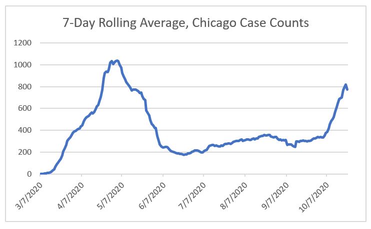
and Region 11, Chicago: level through July and August, drop in September to a low of 21 on Oct. 3, then up to 41 on Oct. 23.
(Note that the Wirepoints numbers are total hospitalizations; these are admissions on any given day.)
But, again, here’s suburban Cook County according to the IDPH dashboard:
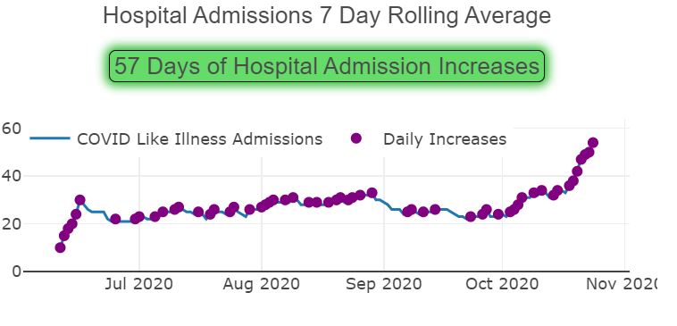
But at the same time, the Cook County Department of Public Health‘s own website’s reported hospitalizations have been level, showing no change other than a drop-off for the past week due presumably to lags in data reporting. (Note: as of today, they have removed the data on hospitalizations; I have requested an explanation.)
What’s going on? You’ll have to trust me that the CCDPH data was level, because it’s been removed, but is the fact that the state includes “covid-like illnesses” regardless of whether a patient has covid, causing an increase in the numbers? I can well understand using this broader definition back when testing was difficult, but covid tests are no routine for anyone who enters a hospital even for unrelated reasons.
What’s more, here’s the equivalent graph for region 11, Chicago:
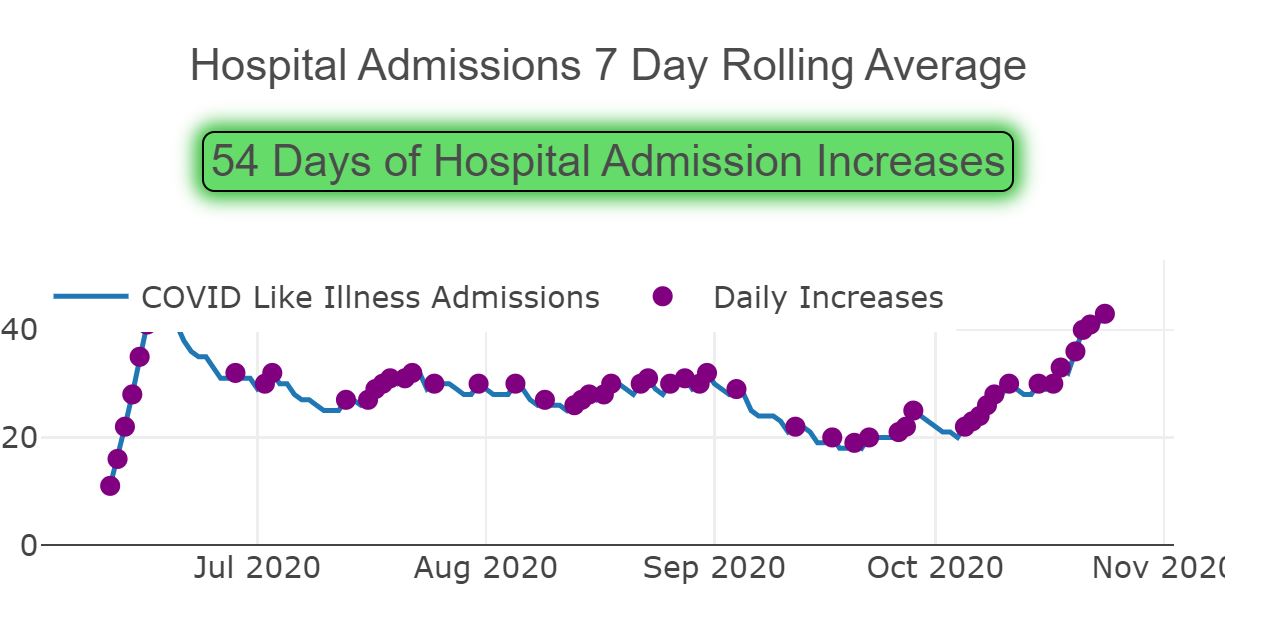
But here are the hospitalizations as reported by the city of Chicago (as downloaded here on October 27):
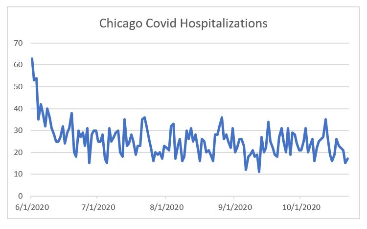
— and this, despite rising case numbers:
Ugh.
Again, are hospitalizations due to covid really on the uptick? Or is it due to “covid-like illnesses”? Or — benefit of the doubt here — is there something faulty about the “covid hospitalizations” figure even after tests have become available without practical limits in terms of hospital access?
Third, what about Europe?
Biden, and Trump opponents generally speaking, are willing to say that a considerable number of America’s covid infections and deaths can be blamed on Trump’s poor management of the pandemic, and it’s easy to point to countries which have had extremely low infection rates — Japan, Taiwan, South Korea. It’s also easy to point to stunningly foolish things Trump has done and said, and the whole mask debacle, well, it’s been a debacle — insisting in March that masks were useless only to later on conclude they weren’t, but stoking substantial suspicion due to that prior insistence.
But claims that the US has been singularly incompetent in managing the pandemic are falling apart.
According to the Financial Times‘ website, measured on a cases-per-million basis, averaged over 7 days, the European Union’s rate equaled that of the US on October 11 or thereabouts. Now it’s rate is substantially higher, at 284.2 cases per million, compared to 200.7 in the US (as of Oct. 22 and 23, respectively). In fact, very few countries within Europe are lower than the US, and many of those which are, are seeing steady increases. Even Germany, lauded for its successful handling of the pandemic early on, is now seeing a surge in cases, with a 14 day change of 191% for new cases and 198% for deaths, compared to an increase of 40% and 14% for cases and deaths, respectively, for the US, according to the New York Times. (Remember, to increase by 191% is not to double, but to triple, that is, for the new case rate to be 3 times that of the original rate.) That means that seems quite likely indeed for Germany to reach our level of cases relative to the population by Election Day, which would be ironic when Joe Biden claims that he would have had German-levels of success in avoiding infections in the U.S.
Why are cases spiking in Europe?
Does that mean that there’s nothing, really, that can be done but hope that a vaccine and/or an antibody treatment is approved, manufactured, and distributed? What does an observation of the case increases in Europe mean for our decision-making about whether to shut down restaurants or merely restrict their capacity, or even to re-institute lockdowns?
This is where I end, as I don’t have answers to these questions, and I’ve achieved my short-term goal of writing now new information I’ve learned and issues I wanted to share.